 Akhand Singh
AI-Native UX · Part 1
Adding AI Is Not the Same as Designing an AI-Native Product
Many products now include AI, but their UX still reflects an older software model. What separates AI-enhanced from AI-native is not the presence of intelligence, but whether the interaction model has truly changed.
Software is full of AI now.
Every product seems to have an assistant, a copilot, a prompt box, or a chat panel attached to the side of an existing interface. On paper, that sounds like progress. Products that once had dashboards, tables, filters, and forms now also have AI.
But many of these products still do not feel AI-native.
They feel like old software with AI taped onto it.
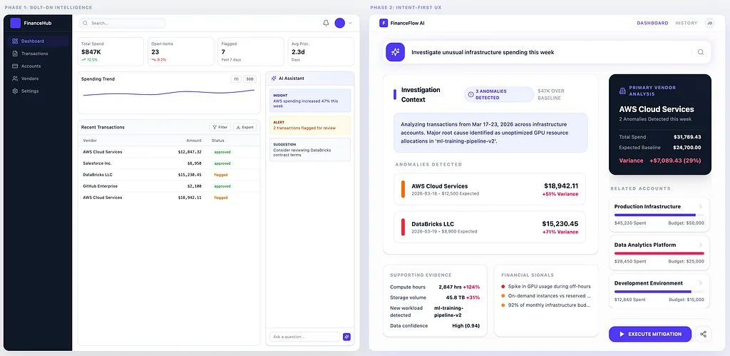
Adding AI to a product does not make it AI-native. What changes the experience is when the interface itself reorganizes around the user’s goal.
This is the distinction many products still miss.
On the left, AI has been added to the product, but the product still starts the old way: with dashboards, tables, and manual inspection.
On the right, the interface starts with intent instead. The system reorganizes the workspace around the task, bringing the most relevant anomalies, evidence, relationships, and actions into one place.
And users can feel the difference immediately.
The current pattern: AI as an extra layer
A lot of AI product work today follows the same pattern: keep the same navigation, workflows, dashboards, filters, and forms, then add a chat panel and call it transformation.
From a roadmap perspective, this is understandable. It is faster to ship an AI feature than to rethink the structure of the product itself.
But from a UX perspective, that often creates a mismatch. The product still expects users to navigate the old way, assemble context manually, and force-fit their workflow into the product’s rigid menus. AI becomes an accessory rather than a new interaction model.
That is why so many AI features feel impressive but still disconnected. The intelligence exists, but the experience has not fundamentally changed.
Why chat alone is not enough
Chat can be a useful interface. It lowers friction and gives users a natural way to express intent.
But chat alone is not what makes a product feel AI-native.
A chatbot added to a traditional product often behaves like a parallel workflow rather than an integrated one. Users ask questions in one place, then go somewhere else to verify the answer, inspect the evidence, and take action.
This is the key problem: text alone does not equal transformation.
In fact, relying entirely on text can degrade the experience. Jakob Nielsen argues that today’s chat-based AI interfaces are still primitive.
In practice, that often means users have to behave like prompt engineers to get outcomes that a well-designed visual interface could have surfaced much faster.
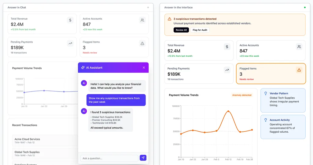
On the left, the answer lives in chat. On the right, the answer reshapes the interface.
If a user asks, “What is causing this issue?” and receives a well-written paragraph, that may be helpful. But if they still have to open panels, compare charts, filter entities, and locate supporting evidence on their own, the AI has not changed the workflow. It has only narrated it.
AI-native products do more than answer. They dynamically adapt the interface, bring the most relevant context closer, and reduce the amount of manual orientation users must perform before they can act.
The real gap: workflow vs interface decoration
The biggest misunderstanding in AI product design is assuming that intelligence can be added without changing the workflow.
But workflows are exactly where the difference shows up.
In traditional software, users are often expected to translate their intent into the product’s language. They need to know which page to open, which filter to use, which report to trust, which data matters, and which next step is even possible.
This dynamic is a perfect example of Tesler’s Law, which states that every system has an inherent amount of complexity that cannot be removed — it can only be shifted.
For decades, the user has borne the burden of managing that complexity through manual navigation. In AI-native software, the system finally absorbs it.
Instead of asking, “Which page do you want?” they can start with, “What are you trying to figure out?”
Instead of making users manually assemble evidence across disconnected surfaces, they can pull together the most relevant context around the task.
For example, in a traditional product, a user might search for a churn report, click through filters, open the right dashboard, and then ask an AI sidebar to summarize what changed. In a more AI-native product, the system might detect an unusual churn spike, open a churn investigation workspace automatically, surface the likely drivers, and bring the most relevant evidence and next actions into one place. The difference is not that one product has AI and the other does not. The difference is where the work begins.
Instead of returning a static answer, they can generate a working state:
- Pre-filtered views
- Relevant entities
- Likely explanations
- Suggested next actions
- Inline ways to refine or correct the system’s direction
This is where the product starts to feel different. Not because it has AI somewhere inside it, but because the intelligence is changing how the interface behaves.
That is what many current implementations miss. They add AI to the chrome of the product, but not to the core movement of the experience.
Feature insertion vs interaction redesign
This is the distinction I think more product teams need to make.
Feature insertion means adding AI to the existing product structure.
The architecture stays the same. The navigation stays the same. The workflow stays the same. AI is introduced as one more capability inside an otherwise familiar interaction model.
This approach can still create value. It can speed up certain tasks. It can reduce friction in isolated moments. It can improve discoverability or help users summarize information faster.
But it rarely changes the feeling of the product.
Interaction redesign means rethinking how the product starts, responds, guides, and adapts when intelligence is available.
That usually means asking more foundational questions:
- Should the product still begin with navigation, or with intent?
- Should users have to assemble their own context, or should the system prepare it?
- Should answers remain separate from action, or should the interface evolve in response?
- Should the same layout serve every task, or should the product adapt based on what the user is trying to do?
- How easily can a user undo, reject, or revise a system-generated change when the interface adapts in the wrong way?
These are not small UI decisions. They are product decisions.
And that is why AI-native UX is not just a new layer of interface polish. It is a deeper shift in how software organizes work.
True transformation requires moving beyond simple automation toward what Microsoft defines as Human-AI Interaction, where the system supports human agency rather than replacing it.
Why bolted-on AI feels disconnected
When AI is bolted onto an older product architecture, users feel the seams.
They see a product that still behaves like traditional software, except now it also has a place to type questions. The system may sound more natural, but the underlying product still expects the same manual effort from the user.
That creates several experience problems.
First, the AI often lacks enough product context in the moment it is used. It may respond generally when the user needs specificity. Or it may know something useful but have no way to express that intelligence through the actual interface.
Second, the user is forced to bridge the gap between conversation and execution. They receive an answer in one surface and then perform the work in another. That extra translation effort becomes part of the UX tax.
Third, the surrounding product still reflects a page-first model, not a goal-first model. Users must still navigate the product’s structure even when their real need is much simpler: solve this issue, understand this account, prepare for this meeting, identify this risk, move this work forward.
This is why many AI-enhanced products feel more capable, but not more coherent.
The AI is present, but the product has not been reorganized around it.
What AI-native UX actually starts to look like
AI-native UX does not mean every product becomes a chat app. It means the product begins to treat intelligence as part of the interface logic itself.
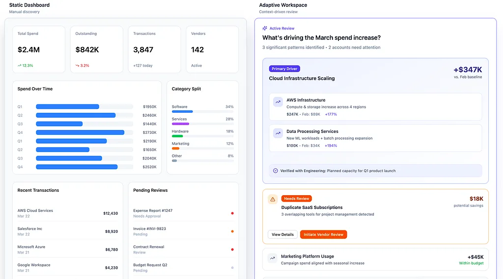
AI-native UX does not just add intelligence to the screen. It changes the hierarchy of the workspace around the question the user is trying to answer.
That can show up in many ways:
- A task-first entry point instead of page-first navigation
- Interfaces that adapt based on what the user is trying to accomplish
- Systems that assemble relevant context before the user asks for every piece of it
- Workflows that move from explanation into action without forcing users to restart elsewhere
- Products that guide, narrow, recommend, and restructure — not just respond
In other words, the product starts acting less like a static toolset and more like a collaborative system.
This shift redefines the user’s role. They are no longer manual operators navigating a system; they are editors and supervisors of an intelligent partner.
The UX must reflect this by making it as easy to reject and refine as it is to accept and execute.
That doesn’t remove the need for good UI — in fact, it increases it.
When intelligence enters the product, clarity matters even more. Users need to understand what the system is doing, why it is surfacing certain information, where confidence is high or low, and how to steer the experience when the system is partially right, wrong, or incomplete.
But AI-native UX also has to be legible, not just adaptive. Designing for transparency is essential; as Google’s People + AI Guidebook suggests, users need to see the why behind an AI’s output to calibrate their trust effectively.
This isn’t just a design preference; recent research indicates that AI Acceptance Rate — the metric of how often users actually rely on a suggestion — drops significantly if the why behind the output is hidden.
When a system surfaces a likely explanation, changes the workspace, or recommends a next action, users need to understand why. They need evidence, context, and a way to verify what the system is doing — especially when the model may be partially right, wrong, or overly confident. The goal is not to make the interface feel magical. It is to make intelligence useful, steerable, and trustworthy inside the workflow.
AI-native UX is not about replacing interface design with prompting.
It is about designing interfaces that can work with intelligence responsibly and usefully.
The shift from navigation to intent
One of the biggest shifts behind AI-native products is moving from navigation-first design to intent-first design.
Traditional software is organized around destinations. Dashboards. Tables. Reports. Settings. Search. Pages. Modules.
Users learn the structure of the product and then move through it to achieve their goals.
AI-native products can begin somewhere else.
They can begin with intent.
Not “Which page are you looking for?”
But “What are you trying to do?”
That change seems small, but it has big implications.
When a product starts with intent, it gains permission to reorganize the experience around the user’s goal. It can surface the right data, suppress noise, suggest likely paths, and construct a useful working state instead of making the user build one from scratch.
But adaptivity has to be balanced with consistency. If the interface reorganizes too often, too aggressively, or without clear rationale, it can feel jumpy instead of helpful. AI-native UX should reduce cognitive load, not replace it with a new kind of unpredictability.
The best systems will adapt around the task while still preserving enough structure, continuity, and memory for users to stay grounded. While AI allows for more dynamic interfaces, we must still respect Jakob’s Law, which reminds us that users rely on familiar patterns to feel in control of their digital environment.
Intent-first UX also does not mean dropping users into an empty box and hoping they guess what is possible. Good AI-native products still need constraints, scaffolding, and visible affordances. Suggested tasks, starter prompts, recent workflows, and contextual entry points help users understand both what the system can do and how to begin.
That is a fundamentally different interaction model from “here is the full product, now go figure it out.”
And that is what makes a product start to feel AI-native — not just because AI is present, but because the product is using intelligence to reduce orientation cost and guide action.
This is the real design challenge
The design challenge in AI products is no longer where to place the prompt box. It is deciding what happens after the prompt.
A truly AI-native product does not just reply with text and leave the workspace untouched; it transforms the state of the interface in meaningful ways. Instead of forcing the user to know exactly where every feature lives, the system must actively bridge the gap between intent and execution.
AI can no longer remain an isolated feature on the periphery — it must become the core operating model of the product itself.
These are harder design choices than simply adding a new chat panel, but they are the only ones that matter. If we avoid them, we risk building products that are technically AI-powered, but experientially unchanged.
Where this series is going
This is the first article in a series about what makes an interface feel AI-native.
In the next parts, I’ll go deeper into the shifts that define this transition:
Part 2 — From Navigation to Intent: Why the next generation of software starts with a goal, not a dashboard.
Part 3 — What Makes an Interface Feel AI-Native: The product traits that separate real AI-native UX from prompt-box theater.
Part 4 — Context Is the New Interface: How users shape the context that powers AI.
Part 5 — Designing AI for Trust, Evidence, and Action: How users verify, refine, and approve AI-generated work.
Part 6 — A Copilot Sidebar Is Not an AI UX Strategy: Why chat alone is not the future of AI UX.
Part 7 — The Frontend Architecture of Intelligent Interfaces: The new building blocks behind AI-native products.
Part 8 — Designing Agentic UX for Complex Products: How enterprise interfaces evolve when AI begins to monitor, recommend, and act.
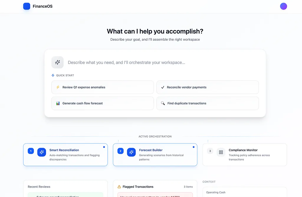
The shift from navigation to intent can begin at the very first screen.
That is where this conversation gets more interesting.
Because the future of AI products will not be defined by who added a prompt box first. It will be defined by who redesigned the interaction model so the product itself feels meaningfully different.
Not more crowded.
Not more verbose.
Different.
It will be a shift toward interfaces that are aware of intent, capable of structuring work, and designed to turn intelligence into action.
The difference between AI included and AI-native is not a feature check. It is a design shift.
And that shift starts the moment a product stops asking, “Where do you want to go?” and starts asking, “What are you trying to do?”
Is your team building “Features” or “Interactions”? Moving from navigation-first to intent-first design is a massive cultural shift for product teams. I’d love to hear from other PMs and Designers: What is the biggest hurdle you’re facing in making your product feel truly AI-native?