 Akhand Singh
AI-Native UX · Part 2
From Navigation to Intent: The UX Shift Behind AI Products
In Part 1, I argued that AI-native UX begins when software stops asking, “Where do you want to go?” and starts asking, “What are you trying to do?”
That shift sounds simple, but it changes more than language. It changes the starting point of the product.
Traditional software was built around navigation. Dashboards, reports, tables, filters, modules, and pages gave users a map of the system. If you learned that map well enough, you could usually get where you needed to go. The interface rewarded familiarity. It assumed that value began when the user entered the right part of the software.
AI introduces a different possibility.
When a system can interpret goals, assemble context, and help shape the right working state, the user no longer has to begin with the product’s structure in the same way. They can begin with intent.
That is one of the deepest UX shifts behind AI products.
This part is about that shift more directly: from navigation-first software, which assumes work begins with destinations, to intent-first software, which assumes work begins with the user’s goal.
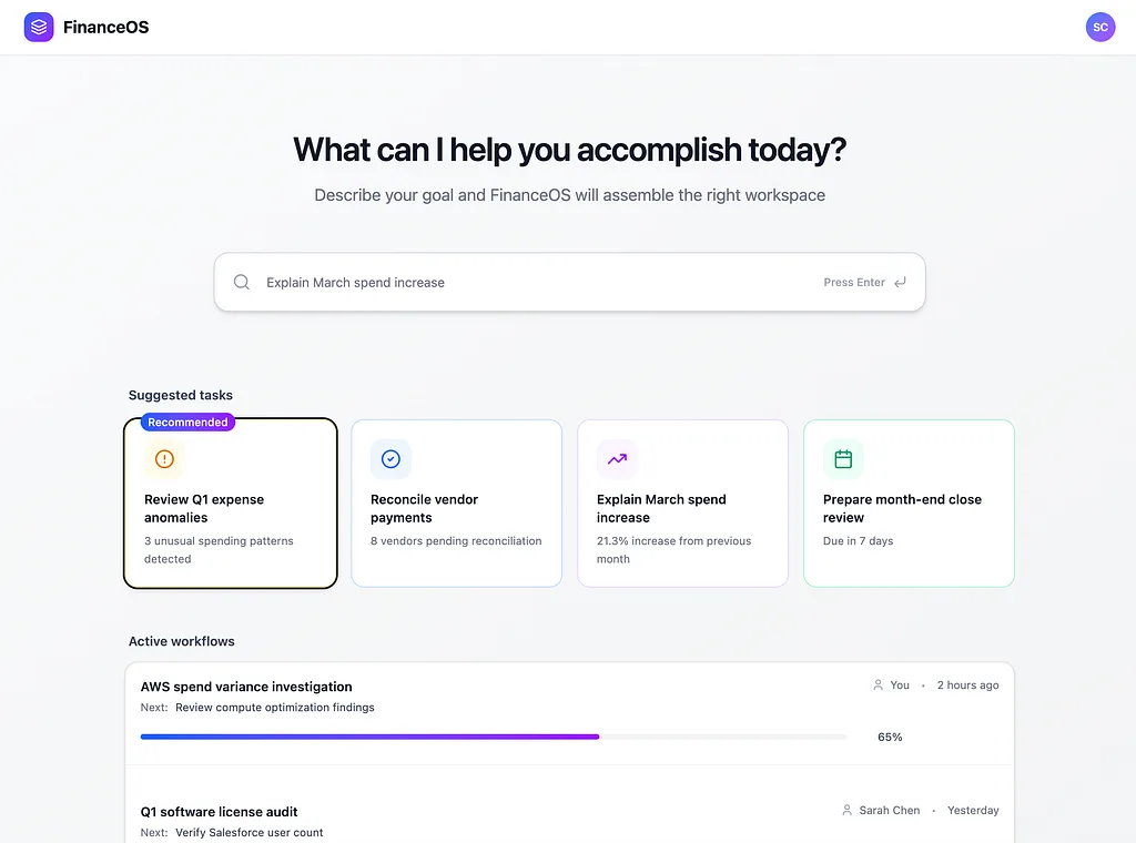
Intent-first products do not begin by asking users where to go. They begin by asking what users are trying to do.
Traditional software was built around destinations
Most software has historically been organized around places.
The dashboard. The analytics screen. The report builder. The settings panel. The account record. The workflow page.
Even as products became more sophisticated, the underlying assumption often stayed the same: users would learn the product by learning its structure. That is why so much software design has revolved around navigation systems, information architecture, tabs, modules, search, filters, and drill-down flows.
These are not arbitrary patterns. They are what software looks like when the interface has to expose capability through structure.
If a user wants to understand churn, review spend anomalies, investigate account health, or explain a KPI shift, the traditional product usually asks them to translate that goal into the system’s map. The user has to know where the relevant information probably lives, what sequence of screens might help, and how to assemble the path through the interface.
That is what navigation-first UX really means.
It does not just mean there is a sidebar. It means the product assumes that progress begins when the user finds the right destination.
Why this model worked for so long
Navigation-first software was not a mistake. It was a good answer to the kind of software most products used to be.
When systems were primarily deterministic, they could store, calculate, retrieve, and display. They could not reliably interpret broad intent, assemble the best evidence for a task, or generate a task-specific workspace in response to a user’s goal.
So the interface had to do more of that work explicitly.
Dashboards summarized the system. Tables exposed raw information. Reports organized history. Search helped users jump toward known destinations. Filters narrowed scope. Pages separated responsibilities. Modules made capabilities visible.
This model worked because the system itself was not doing much interpretation on the user’s behalf.
The burden fell on the user. The user had to learn the map, find the right place, combine the right views, interpret what mattered, and decide what to do next.
For a long time, that was normal. And in many cases, it still is.
Navigation-first UX remains stable, learnable, and supportive of habit. It gives users continuity, boundaries, and familiar patterns they can return to.
But it also creates a hidden cost.
The hidden tax of navigation-first UX
The strength of navigation-first design is that it makes software explorable.
Its weakness is that it often makes the user do the assembly work.
A user usually does not wake up wanting to “go to the reporting module.” They want to answer something or move something forward. Why did spend increase? Which accounts need attention? What changed this week? What should I review first?
But traditional products rarely begin there.
They begin with the product’s structure. And then the user begins assembling. They open the dashboard, apply the right filters, inspect a chart, drill into a table, search for related context, compare views, form a theory, and then increasingly ask AI to summarize what they have already uncovered.
You can see this navigation tax in small workflow moments. In a traditional product, the path might look like this: open the dashboard, apply the right filter, search for the relevant account, compare the variance, then ask AI to summarize what changed. In a more intent-first product, the flow is shorter: state the goal, let the system assemble the investigation workspace, review the likely drivers, and move to the next useful action.
The difference is not only speed. It is cognitive burden.
Navigation-first software often leans heavily on recall. This maps directly to Jakob Nielsen’s usability heuristic of recognition rather than recall: good interfaces reduce memory load by making actions, options, and next steps visible instead of forcing users to remember the path. Navigation-first products often make users recall where the answer lives. Intent-first products work better when they shift more of that burden toward recognition, and sometimes even anticipation, by surfacing the right entry points, relevant context, and likely next steps before users have to reconstruct them manually.
That is one of the deepest UX implications of AI. Once the system can help assemble the work, the cost of navigation-heavy interaction starts to look less inevitable.
That burden is not just conceptual. UX research has shown that when navigation is harder to discover or users must take extra steps to expose and move through it, task time increases and perceived task difficulty goes up. Intent-first systems have an opportunity to reduce that friction by bringing the right workspace closer to the goal.
Intent-first UX starts from a different assumption
Intent-first UX begins with a different question. Not “Which page do you want?” but “What are you trying to figure out?” Not “Which module should we open?” but “What are you trying to accomplish?”
That is not just a softer prompt. It reflects a different assumption about where work begins.
It also changes the distance between the user’s goal and the system’s response. Don Norman described the Gulf of Execution as the gap between what a user wants to do and the means available to do it. Navigation-first products often make users bridge that gulf manually. Intent-first products can begin to collapse it by moving the system closer to the goal itself.
Navigation-first products assume the user should adapt to the software’s structure. Intent-first products assume the software should help adapt itself to the user’s goal.
Once the system understands intent, it can begin doing more of the assembly work. It can choose relevant context, narrow the field, suppress irrelevant noise, surface likely drivers, assemble the right working state, and guide the next useful move.
That changes the UX in a meaningful way.
The value of the product no longer depends only on whether the user can navigate well. It also depends on whether the system can reduce orientation cost and help users begin closer to the work they actually need to do.
Intent-first does not mean structure disappears
This is where AI product conversations often become simplistic.
Intent-first UX does not mean every product becomes a blank prompt box. It does not mean dashboards vanish, navigation dies, or users want to negotiate every task through natural language. Structure still matters because users need continuity, predictability, visible capability boundaries, and stable reference points they can return to.
The real shift is not from structure to no structure.
It is from structure as the default starting point to intent as the more useful starting point for many tasks.
That means the best AI-native products will likely combine stable product foundations with intent-based entry points, suggested actions, contextual workspaces, visible next steps, and clear ways to refine, reject, or reset the system’s direction.
It also means adaptivity has to be balanced with continuity. If the interface reorganizes too often, too aggressively, or without clear rationale, it can feel jumpy instead of helpful. Intent-first UX still needs anchors: stable reference points, familiar patterns, and enough structural consistency for users to stay oriented as the workspace adapts around the task.
And intent-first UX does not mean dropping users into an empty box and hoping they guess what is possible. Good AI-native products still need scaffolding. Suggested tasks, starter prompts, recent workflows, and contextual entry points help users understand what the system can do and how to begin.
That is why intent-first design is not the removal of UX structure. It is the redesign of where UX starts.
Why dashboards still matter
One of the easiest mistakes to make in AI product thinking is to assume that intent-first UX makes dashboards obsolete.
It does not.
Dashboards still matter because they serve functions that remain valuable. They help users orient themselves, monitor a system over time, scan for changes, build confidence, and maintain awareness of overall state.
One useful way to think about the difference is that dashboards are better for asynchronous awareness, while intent-first workspaces are better for synchronous problem solving. Dashboards help users monitor the system over time. Intent-first UX helps them act when something specific needs to be understood, explained, or moved forward.
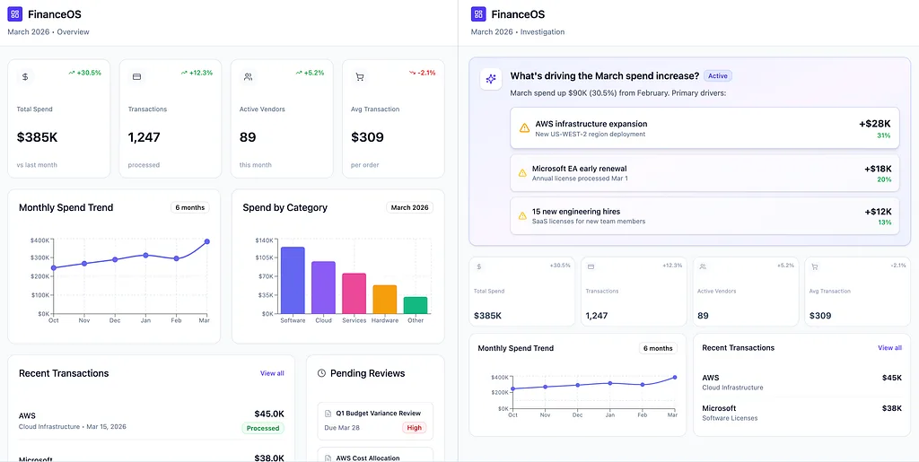
Dashboards still matter, but they no longer need to be the universal starting point for every task.
The issue is not that dashboards exist. It is that many products still treat the dashboard as the universal starting point for everything.
That made sense when dashboards were one of the best ways to expose a system the user had to interpret manually. But if software can now assemble context around a task, the dashboard becomes one tool among many, not the front door for every meaningful workflow.
In AI-native products, dashboards increasingly become awareness surfaces, monitoring layers, contextual reference points, and stable home bases. They still matter. They just do not always need to be where action begins.
A FinanceOS user investigating a spend increase may not want a broad financial summary first. They may want the product to open a spend investigation workspace around the anomaly itself.
A finance lead reviewing month-end issues may not want to start with every KPI at once. They may want the system to surface what changed, what is likely driving it, and what needs attention now.
Dashboards remain useful. They are just no longer the only reasonable place for work to start.
Why copilots emerged
Copilots emerged because most products were still built around destinations.
That is the key point.
When generative AI became usable, the fastest way to introduce intent into older product architectures was not to redesign the whole product. It was to add a new surface where users could express goals directly.
That surface became the copilot.
Copilots mattered because they solved a real structural problem. They gave users a place to say: explain this, summarize this, compare these, draft that, show me what changed, tell me what matters, help me understand the likely cause, or suggest what to do next.
In other words, copilots emerged because users needed a goal-oriented layer inside products that were still mostly destination-oriented.
That is why they spread so quickly. They were not just fashionable. They were convenient. They gave products a way to support intent without forcing teams to rebuild the whole interaction model immediately.
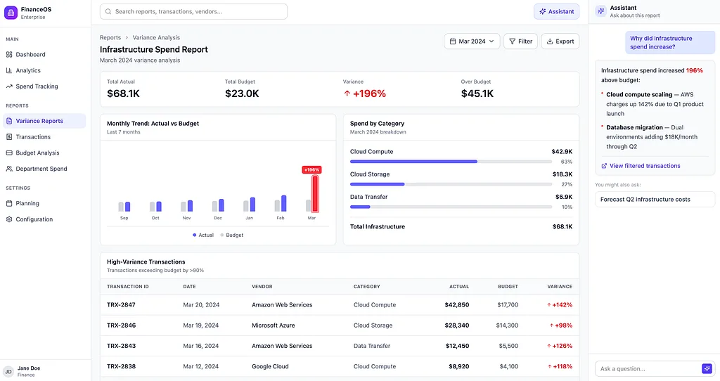
Copilots emerged because users needed a goal-oriented layer inside products that were still built around destinations.
Why copilots often feel transitional rather than final
Copilots are often genuinely useful.
They reduce friction. They make products easier to approach. They create a natural-language layer inside systems that were never designed to begin with intent. In many cases, they are the first meaningful step toward more AI-native UX.
But they are often transitional because they sit beside an interaction model that has not fully changed yet.
The user can express intent in the copilot, but the surrounding product may still expect them to navigate the old way. Answers appear in one place. Action still lives somewhere else. The product sounds smarter, but the working model underneath remains familiar.
That is why copilots often feel useful but incomplete.
They reveal the demand for intent-first interaction, but they do not always satisfy it by themselves.
The longer-term opportunity is not just to give users a smarter sidebar. It is to let the product itself start behaving more intelligently.
That means intent should not live only in the assistant. It should shape what opens, what gets prioritized, what context is surfaced, what actions become visible, and how the workspace is assembled.
Once that begins to happen, the copilot stops being the entire AI strategy. It becomes one input path among others: a refinement tool, a collaborative layer, a follow-up mechanism, a place to resolve ambiguity, or a way to steer the system when needed.
That is why copilots are often transitional rather than final. They are the bridge between navigation-heavy software and products that begin to absorb intelligence deeper into the interface itself.
A FinanceOS example of the shift
You can see this difference clearly in FinanceOS.
In a more traditional version of the product, a finance user might begin on a dashboard, notice that spend is unusually high, open a category report, apply filters, inspect a transaction table, and then ask a copilot to summarize what changed.
In a more intent-first version of FinanceOS, the system might detect the unusual spike, open a spend investigation workspace automatically, surface the likely drivers, highlight the accounts that need review, and bring the most relevant evidence and next actions into one place.
The difference is not that one version has AI and the other does not.
The difference is where the work begins.
That is the deeper UX shift.
What this means for product teams
For product teams, this changes the design question.
The question is no longer only: How do users move through this interface?
It is also: How does the product meet users closer to their intent?
That changes the role of information architecture, navigation, search, dashboards, workspace assembly, suggested actions, correction and refinement, continuity, and trust.
In a navigation-first world, the product’s job is to make the map usable.
In an intent-first world, the product’s job is increasingly to reduce the amount of map-reading required in the first place.
That does not make UX simpler. It makes it more demanding.
Because now the system has to do more than expose information. It has to interpret intent, choose context, preserve trust, maintain continuity, support correction, and help users act without becoming opaque.
That is why the shift matters. It is not just a new pattern. It is a new assumption about where work begins.
Where this leaves copilots
Copilots still matter.
They matter because they helped products make the first move away from rigid navigation-first interaction. They created a place for intent inside systems that were not built around it.
But they should not be confused with the destination.
If users keep needing to ask the side assistant what matters, what changed, what to do next, and where to go, that is often a signal that the surrounding product still has not absorbed enough intelligence into its own structure.
That is the deeper lesson.
The most important AI UX shift is not that software can now talk. It is that software can increasingly begin from the user’s goal rather than forcing the user to begin from the software’s map.
Where this series is going
In Part 1, we looked at why adding AI does not automatically make a product feel AI-native. In this part, we defined the first major structural shift: moving from navigation-first to intent-first interaction.
But once a product begins with intent, the static interface of the past is no longer enough. The workspace itself has to become more responsive to the task, while still preserving the structure and continuity users need to stay oriented.
That is where I want to go next: what makes an interface feel adaptive instead of static, how context becomes part of the interface itself, and why trust, evidence, and user control become even more important as software moves from assistive AI toward more agentic behavior.
The most important shift in software is not that it can now talk. It is that it can begin from the user’s goal rather than forcing the user to begin from the software’s map.
In the next article, I’ll go deeper into what happens after the prompt: the rise of the adaptive interface.
Where does your product still make users navigate before users can think? Moving from navigation-first to intent-first design is not just about adding a prompt box. It is about changing the starting point of the work itself. I’d be curious to hear from other product teams: what is the hardest part of reducing that navigation tax in your own product?