 Akhand Singh
AI-Native UX · Part 3
Why Adaptive Interfaces Change What UX Needs to Do
Once software begins with intent, the interface can no longer stay still. The next shift in AI-native UX is not just understanding the user’s goal, but reshaping the workspace around the work itself.
In Part 1, I argued that adding AI does not automatically make a product feel AI-native.
In Part 2, I argued that one of the deepest shifts behind AI products is the move from navigation-first software to intent-first software. Instead of beginning with where the user should go, the product can begin with what the user is trying to do.
But that shift creates a new design problem.
Once intent becomes the starting point, the interface cannot remain entirely static.
If a system can understand the user’s goal, gather relevant context, surface likely next steps, and assemble the right working state, then the old model of a fixed interface begins to feel incomplete. The product no longer needs to present the same shape in the same way every time. It can start reorganizing around the task at hand.
That is where adaptive interfaces enter the picture.
This is one of the next major shifts in AI-native UX. The interface is no longer just a stable container for features. It begins to act more like a responsive working surface, one that changes emphasis, structure, and support based on what the user is trying to accomplish.
That sounds powerful, and it is.
But it also changes what UX needs to do.
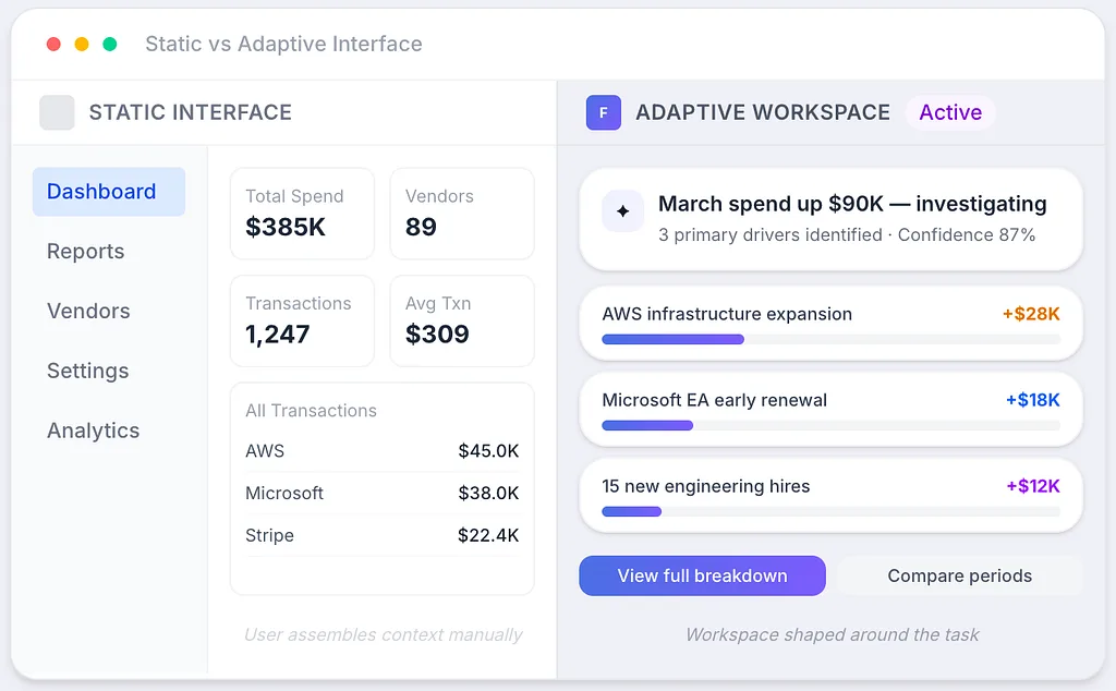
Left: Static enterprise interface where the user assembles context manually. Right: Adaptive workspace shaped around the task at hand.
Static interfaces were designed to expose capability
Most software interfaces were built around a relatively stable assumption.
A product had a set of capabilities. The job of UX was to expose those capabilities clearly enough that users could learn the system and use it well. Pages separated functions. Navigation structured movement. Tables, dashboards, filters, forms, and detail views helped users access the right part of the product at the right time.
This model worked because software could not do much interpretation on the user’s behalf.
The system could store, calculate, sort, visualize, and retrieve, but it usually could not understand why the user had arrived or what kind of support the moment actually required. So the interface had to stay stable enough for the user to build familiarity over time.
That stability mattered. It still matters.
Consistency is not just a visual preference. It is one of the ways software becomes learnable. A stable interface gives people a mental model they can return to. It lets them develop fluency. It reduces friction through repetition.
But AI changes the conditions that produced that model.
Once a system can interpret a task instead of merely waiting for commands, the interface no longer has to expose everything the same way every time. It can begin to shift what it emphasizes, what it opens, what it suppresses, and what it suggests based on the work the user is actually trying to move forward.
This is where the interface stops being only a map.
It starts becoming a participant.
An adaptive interface is not the same as a personalized one
This distinction matters because the two ideas are often blurred together.
A personalized interface changes based on the user. It remembers preferences, recovers recent activity, surfaces shortcuts, or adjusts itself according to role, history, or habits. It says, in effect, I know who you are.
An adaptive interface changes based on the task. It responds to intent, context, evidence, timing, system state, and likely next actions. It says something closer to this: I understand what you are trying to do right now.
That is a much more important shift.
A product might personalize the home screen for a finance lead, a support manager, or an operations engineer. But adaptivity is something else. It is what happens when the system recognizes that the user is not just opening the product. They are investigating a drop, preparing a decision, comparing explanations, reviewing risk, or trying to take action.
In that moment, the interface does not just need to feel familiar.
It needs to feel relevant.
That is why adaptive UX matters. It is not mainly about making products feel smart. It is about making them better aligned to the work happening now.
The unit of design begins to change
In traditional software, the page was often the primary unit of design.
Teams thought in screens, destinations, flows, modules, and panels. Even when the product was sophisticated, the design logic was still built around relatively fixed places. The user moved through the system by going from one container of functionality to another.
But in more AI-native products, the more important unit increasingly becomes the workspace.
A workspace is not just a screen. It is a task-shaped environment.
It gathers the context, signals, evidence, actions, and next steps most relevant to a specific goal. It may still sit inside a broader product structure, but it is no longer defined only by navigation. It is defined by what the user is trying to move forward.
That changes the design problem in a serious way.
The question is no longer just, what should this page contain?
It becomes:
What does the user need to see first?
What context is essential here?
What should remain visible as evidence?
What is the system confident about?
What is still uncertain?
What actions should become available now?
What must stay stable so the experience still feels trustworthy?
That is a more demanding design problem than laying out a good screen.
It requires UX to think less like page composition and more like orchestration.
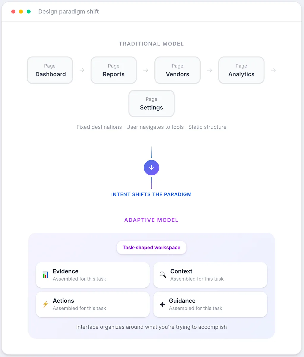
The shift from pages and destinations to task-shaped workspaces assembled from evidence, context, actions, and guidance.
Adaptivity matters because work is uneven
One reason static interfaces often create friction is that real work is not evenly distributed.
Some moments are routine. Some are ambiguous. Some are urgent. Some require explanation. Some require decision-making. Some require collaboration. Some require only one key piece of evidence hidden inside a large amount of noise.
Static interfaces tend to flatten these moments too much.
They treat different kinds of work with roughly the same structural response. The user arrives, opens the same containers, scans the same layout, applies the same filters, and then begins assembling meaning on their own.
That is where adaptive interfaces can create real value.
If the user is reviewing a normal status check, the product may remain broad and lightweight. If the system detects a sharp anomaly, the workspace may become narrower and more investigative. If the user asks for an explanation, the interface may elevate likely drivers, related evidence, recent changes, and confidence signals. If the user is ready to act, the interface may shift toward approvals, recommendations, simulations, or execution paths.
The important point is this: adaptivity is not about motion for its own sake.
It is about task sensitivity.
The goal is not to make the interface feel alive. The goal is to make it feel appropriately shaped for the work the user is in.
That is a much higher standard than simply giving the user an answer.
But adaptivity introduces a new UX risk: instability
This is where the conversation around AI products often becomes too optimistic.
The moment an interface starts changing itself, it also creates a new class of UX failure.
If the system adapts too aggressively, too often, or without enough explanation, the product stops feeling helpful and starts feeling unstable. The user loses continuity. The environment becomes harder to trust. What was supposed to reduce effort begins to create a different kind of cognitive load.
This is one of the central tensions in AI-native UX.
Static systems risk irrelevance.
Over-adaptive systems risk disorientation.
That tension matters because most users do not want a product that constantly surprises them. They want one that helps them without making the environment feel unreliable.
The best adaptive interfaces will not be the ones that change the most.
They will be the ones that change with judgment.
That means adaptivity has to be restrained. Not every signal should cause reconfiguration. Not every inference should reshape the workspace. Not every smart suggestion deserves interruption. A product can be adaptive without becoming restless.
This is where design maturity becomes visible.
Good adaptive UX does not chase maximum dynamism. It decides carefully what should move, what should remain anchored, and what kind of change the user can absorb without losing orientation.
The interface has to make the system’s judgment legible
When AI systems begin shaping the interface, the structure itself starts communicating judgment.
That makes legibility essential.
If a workspace changes because the system believes something matters, the user should be able to understand that shift. They do not need a raw model trace. They do not need technical internals. But they do need the interface to make clear why this working state has appeared, what evidence is supporting it, and what assumptions are guiding it.
This is one of the biggest responsibilities of UX in AI products.
Not just to present output, but to make the system’s framing understandable enough that the user can work with it intelligently.
A good adaptive interface does not simply say, here is your answer.
It helps the user see:
what the system noticed
why this workspace was assembled
what evidence supports the framing
what remains uncertain
what actions are available
how to redirect or refine the interpretation
That is where trust begins.
Not in certainty theater. Not in oversized confidence. But in a structure that helps the user understand the shape of the system’s judgment.
In AI-native products, explanation is not just a model feature.
It is part of interface design.
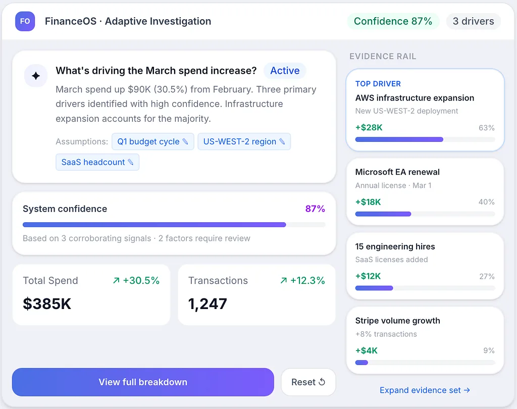
Adaptive workspace with highlighted evidence rail, reasoning summary, confidence indicator, and editable assumptions the user can refine.
The smarter the system gets, the more evidence and control matter
There is a common assumption that as systems get smarter, interfaces should become simpler by hiding more of the machinery.
Sometimes that is true.
Users should not have to assemble every piece of context manually if the system can do meaningful preparation on their behalf. They should not be forced through unnecessary workflow just to reach the obvious next step.
But smarter systems also make stronger judgments. They frame the situation earlier. They decide what matters first. They prioritize evidence. They suggest actions.
And the stronger that system judgment becomes, the more important it is for the interface to preserve user agency.
That means adaptive interfaces need more than smooth output. They need mechanisms for inspection and correction.
Users need to be able to expand the evidence set, challenge the framing, narrow the scope, compare alternate explanations, reset the workspace, or move back to a stable overview when needed.
In other words, the interface should not only help the system guide the user.
It should also help the user guide the system.
That is where many AI products still feel immature. They can summarize, generate, and suggest, but they do not yet always provide a strong enough correction model. They often help with first-pass output, but not with second-pass control.
And second-pass control is where durable trust often lives.
The best adaptive interfaces will feel composed, not chaotic
When people hear the phrase adaptive interface, they sometimes imagine something highly fluid, almost shape-shifting, as if the product should reconstruct itself continuously around every emerging signal.
I do not think that is the most useful direction for serious products.
The best adaptive interfaces will probably feel composed.
They will keep strong structural anchors. They will preserve familiar zones. They will maintain continuity across tasks. They will adapt within a clear system rather than dissolving the system entirely.
A stable shell.
A flexible center.
Clear task framing.
Visible evidence.
Guided next actions.
Easy correction.
That feels like a more realistic model for AI-native UX than total fluidity.
Because users rarely want novelty from serious software. What they want is responsiveness without chaos. They want the product to meet them intelligently while still feeling dependable enough to work inside for long stretches of time.
Dependability is not the opposite of intelligence.
In good UX, it is one of the things that makes intelligence usable.
A finance example makes this easier to see
Imagine a finance lead working in a traditional product.
They open a dashboard, notice margin pressure, move into a reporting area, filter by category, compare periods, inspect underlying entries, and then perhaps ask AI to summarize what changed. The product may be powerful, but the user is still doing most of the structural assembly. They have to move through the system, gather the evidence, and create the working context themselves.
Now imagine a more adaptive product.
The system detects the unusual pattern, recognizes that the likely task is investigation, and assembles a workspace around that need. It surfaces the categories most responsible, highlights recent shifts, shows relevant changes in policy or vendor behavior, presents the strongest evidence first, and exposes likely next questions.
That is already better than just adding a chat assistant.
But the real difference appears in what happens next.
The user can expand or narrow the evidence. They can challenge the framing. They can compare two explanations. They can move from diagnosis into action. They can step back into a stable overview without feeling that the product has abandoned structure entirely.
That is what makes the experience feel designed rather than merely automated.
The point is not to replace structure with motion.
It is to let structure respond meaningfully to purpose.
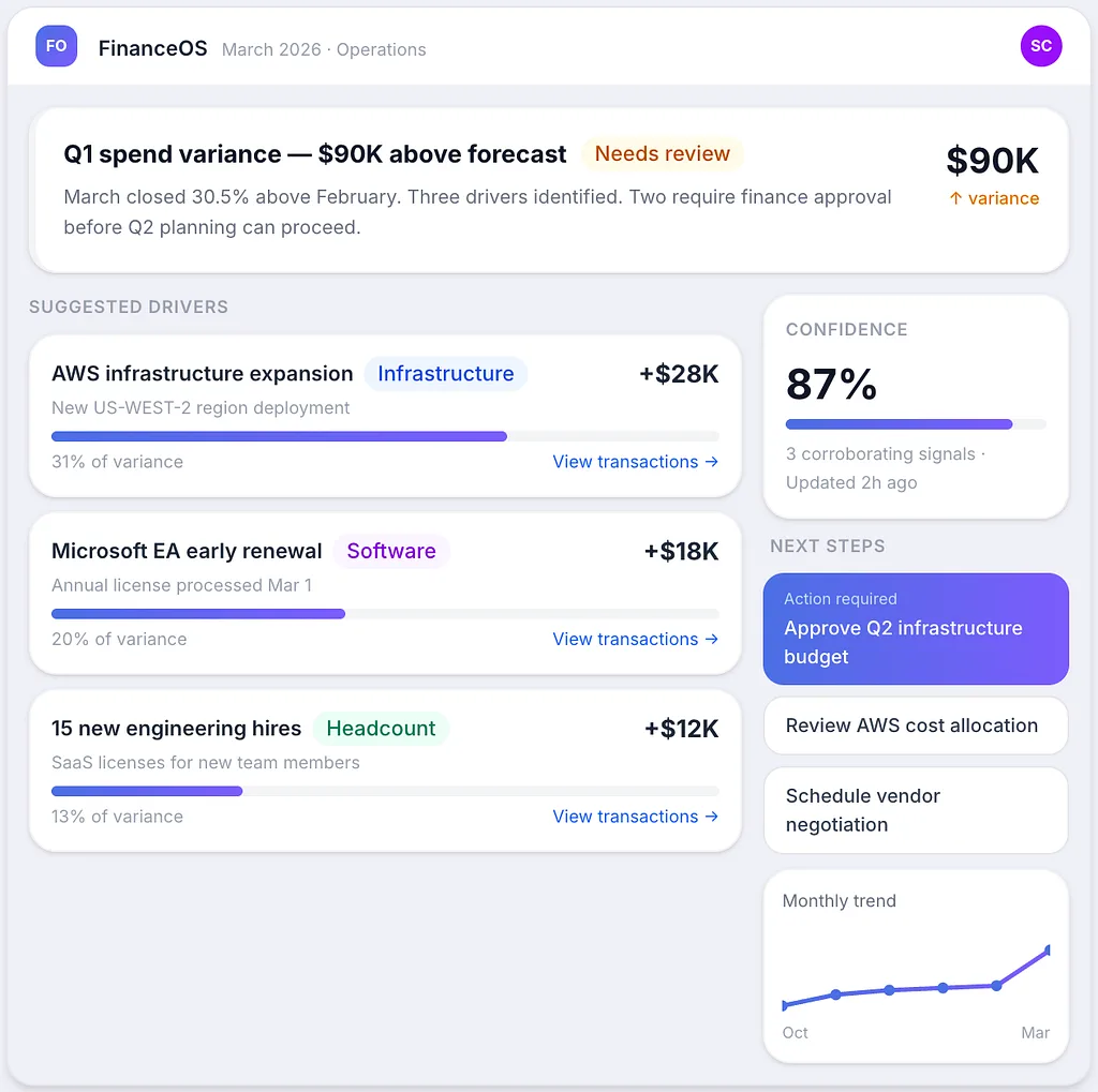
Finance operations workspace: issue summary at top, evidence panel, suggested drivers with confidence, and next-step actions.
This changes what UX teams are actually designing
For UX teams, adaptive interfaces change the work in a fundamental way.
First, teams can no longer think only in terms of screens. They have to think in states, transitions, confidence, evidence, task assembly, and correction paths. The design challenge becomes less about static layout alone and more about how a system should behave as understanding deepens.
Second, trust becomes a structural design responsibility. What remains visible, what gets prioritized, what gets hidden, what can be edited, what can be undone, and what always stays anchored are not secondary decisions. They shape whether the system feels usable and believable.
Third, UX becomes more responsible for designing the relationship between human judgment and machine judgment.
That, more than anything else, is what many AI-native products are really trying to support.
Not pure automation.
Not old software with a chatbot attached.
But a working relationship between human intent, system interpretation, visible evidence, and controllable action.
That is a harder design space than traditional UI.
But it is also a more meaningful one.
Because once software starts adapting to the work itself, UX is no longer only organizing access to features.
It is shaping how intelligence becomes usable.
The next standard for good UX is not just usability, but good adaptation
For a long time, good UX was judged primarily through qualities like clarity, consistency, usability, and learnability.
Those still matter. They will always matter.
But AI products introduce another standard.
A product can be clean and easy to use and still feel structurally old. It can include AI and still feel disconnected from real work. It can accept intent and still fail to reshape the experience in a useful way.
That is why adaptive interface design matters.
The next standard for AI-native UX is not simply whether a system can respond. It is whether the interface can adapt in a way that feels relevant, legible, stable, and trustworthy.
That is a much higher bar than adding a prompt box.
It asks more from the system.
And it asks more from UX.
Where this series is going next
In Part 1, I argued that adding AI does not automatically make a product feel AI-native.
In Part 2, I argued that the deeper shift is from navigation-first software to intent-first software.
This part extends that argument.
Once software begins with intent, the interface cannot remain static in the same way. It has to become more adaptive to the task. But that adaptivity only becomes good UX when it is balanced with continuity, evidence, and user control.
That leads naturally to the next question:
If the interface adapts, how does the user keep trusting it?
That is where I want to go next.
Because the more software begins acting on the user’s behalf, the more important it becomes for the interface to show not just what it can do, but why the user should believe it.