 Akhand Singh
AI-Native UX · Part 4
Designing for Uncertainty: How to Make AI Decisions Feel Trustworthy
In Part 1, I argued that adding AI to an existing layout is not the same as redesigning the interaction model. In Part 2, I examined how the foundation shifts from navigation-first to intent-first software. In Part 3, I looked at how interfaces respond by reshaping the workspace dynamically around the task.
Once an interface adapts to intent, a harder problem immediately appears.
Traditional software is deterministic. You click a button, a database query runs, and the exact records display. If the records are wrong, it is a data entry error or a bug in the code. The system does not guess, estimate, or approximate. The interface presents raw facts, and the user assumes mechanical precision.
AI is different. Machine learning models do not return certainty; they calculate statistical likelihoods. They predict tokens, classify embeddings, evaluate clusters, and compute confidence intervals. When you place a probabilistic engine underneath an interface built on deterministic assumptions, the product experience fractures.
If the system acts confident when it is wrong, the user feels deceived. If the system acts hesitant about obvious facts, the user discards it as useless. If the interface hides its assumptions, users cannot verify the work.
This is the uncertainty challenge in AI-native product design.
Trust is not built by pretending the model is infallible. Trust is built by making uncertainty visible, calibrated, steerable, and actionable.
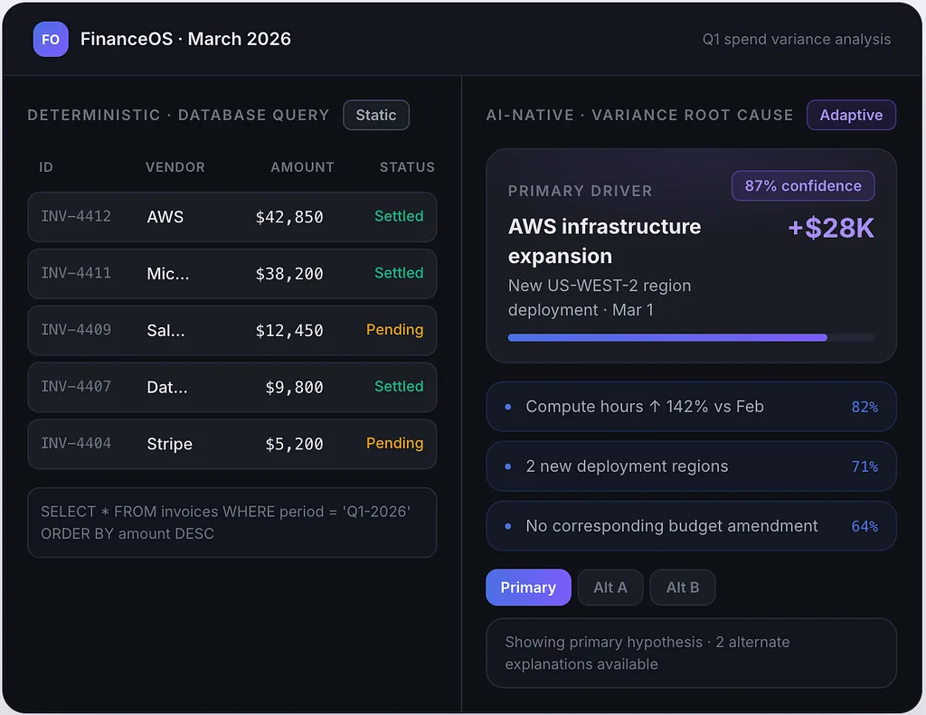
Left: A deterministic grid displaying static database rows with absolute values. Right: An AI-native workspace showing variance root-cause analysis with a primary prediction card, 87% confidence badge, highlighted data signals, and alternative hypothesis tabs.
The Breakdown of Deterministic UX Assumptions
For thirty years, human-computer interaction patterns assumed binary correctness. A state was either saved or unsaved, valid or invalid, present or absent. Form validation returned an error only when a regex or schema check failed.
Probabilistic systems break these baseline expectations in three distinct ways.
First, probabilistic outputs produce non-reproducible states. A prompt or intent expressed identically on two separate days may return different structures, different summaries, or alternate rankings. When an interface adapts around that output, the workspace layout shifts without a direct, deterministic trigger from the user.
Second, probabilistic systems can be subtly wrong. A conventional software failure results in a crash, an empty state, or a 500 error. The failure is noisy and obvious. An LLM or classification model fails silently by generating plausible statements with incorrect facts or erroneous data associations. The UI looks polished, but the underlying judgment is flawed.
Third, the user’s role transitions from direct operator to supervisory evaluator. In a traditional tool, if an anomaly appears in a ledger, the accountant assumes the number is real and audits the transaction. In an AI-native tool, when the system flags a supplier anomaly, the accountant must simultaneously evaluate two questions: Is this transaction actually an anomaly, and did the model accurately analyze the context?
If the interface does not help the user evaluate both questions quickly, cognitive load increases instead of dropping. The user spends more time verifying the system’s output than they would have spent doing the manual work from scratch.
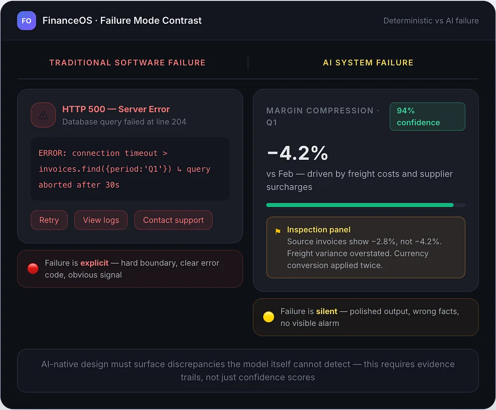
Left: Traditional software failure — a hard error boundary with a 500 code and system alerts. Right: AI failure — a subtly hallucinated metric inside a polished card, with an inspection panel surfacing the discrepancy between source invoices and generated output.
The Trust Calibration Problem
Product teams often assume the goal is to make users trust the AI completely. That is a mistake.
Over-trust leads to automation complacency, where users blindly approve erroneous suggestions, publish incorrect calculations, or accept bad system actions. Under-trust leads to product abandonment, where users bypass the intelligence entirely and return to manual navigation and manual spreadsheets.
The real goal is calibrated trust: the user’s confidence in the system matches the actual reliability of the system for that specific task in that specific moment.
Calibrating trust requires the interface to communicate confidence without cluttering the screen with statistical jargon.
Why Raw Percentages Fail in Everyday UX
Placing an badge reading “94% Confidence” next to every output rarely solves the problem. To a financial analyst or an operations lead, what does 94% actually represent?
Does it mean the model is 94% certain that the data exists? Does it mean 94% of the training distribution aligns with this case? Or does it mean there is a 6% chance that the recommended adjustment is disastrously wrong?
Raw probabilities confuse users because machine confidence is not human certainty. A language model can generate a completely hallucinated explanation with 99% token-probability metrics if its prompt context was misleading or incomplete.
Instead of exposing raw numbers everywhere, AI-native UX relies on qualitative confidence bands paired with explicit drivers:
- High Confidence (Verified Baseline): The system has complete source evidence, matched historical precedents, and clean data pipelines. The UI emphasizes immediate action while keeping evidence one click away.
- Moderate Confidence (Plausible Inference): The system sees strong correlations but detects missing variables, conflicting historical records, or partial edge-case matches. The UI surfaces the recommendation as a proposal, highlighting assumptions directly in the view.
- Low Confidence (Ambiguous Context): The system lacks sufficient data or detects contradictory signals. The UI avoids automated conclusions, assembling an exploratory workspace that asks the user to clarify intent or resolve conflicting facts.
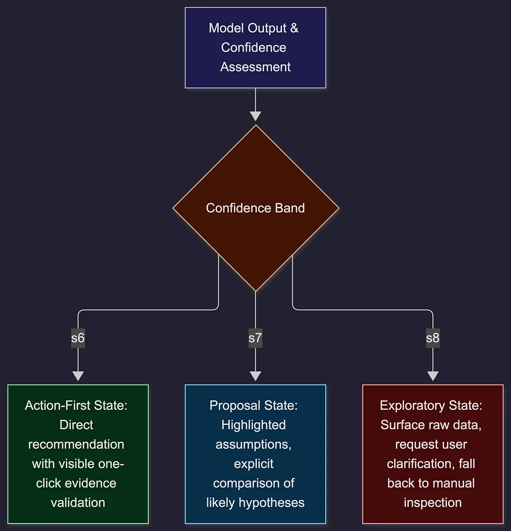
Qualitative confidence bands paired with explicit drivers
Practical Patterns for Legible Reasoning
To make probabilistic decisions trustworthy, the interface must make the system’s reasoning legible. Legibility does not mean dumping JSON traces, embedding vectors, or full system prompts onto the screen. It means providing clear, structural answers to four practical questions:
- What signals did the system use?
- What assumptions did it make?
- What alternate explanations were discarded?
- How can the user adjust the parameters?
Here are specific UI patterns that answer these questions inside enterprise workflows.
Pattern 1: Progressive Disclosure of Evidence
When an AI-native system synthesizes information, it should never present a bare paragraph of text as an authoritative answer. Every claim must be tethered to identifiable source records.
In FinanceOS, when the system detects an unexpected margin compression in European operations, it should not simply say: “Margin decreased by 4.2% due to increased freight costs and supplier surcharges.”
Instead, it presents the core insight with inline visual anchors. Clicking or hovering over “freight costs” opens a grounded drawer containing the three specific logistics invoices, the month-over-month variance delta, and the relevant currency conversion rates applied.
This follows the rule of progressive disclosure: present the synthesis cleanly for rapid scanning, but keep the underlying evidence immediately accessible for audit. The user never has to wonder if the model invented the insight; the proof sits right beneath the surface.

Progressive disclosure in practice: an anomaly summary with underlined source references in the center, and an expanded evidence drawer on the right showing interactive invoice line items, timestamped ERP records, and a filter toggle to audit the source material.
Pattern 2: Explicit Assumption Controls
Machine learning models frequently make implicit assumptions when interpreting broad user intent. If a user asks FinanceOS to “Forecast Q3 operating spend under headcount expansion,” the system must assume specific salary bands, ramp-up schedules, and regional tax implications.
A static interface hides those variables. An AI-native interface extracts them into an interactive Assumption Bar.
At the top of the generated forecast workspace, the interface renders a structured chip bar:
- Hiring Pace: 15 roles/month (Historical Average)
- Location Mix: 60% US / 40% EU
- Inflation Adjustment: 3.2%
If the financial analyst knows that hiring will actually occur entirely in Canada, they do not need to rewrite their entire prompt. They click the Location Mix chip, adjust the dropdown to 100% Canada, and the workspace recalculates. The interface treats the model’s judgment as a flexible baseline, giving the user direct control over the operational inputs.
Pattern 3: Hypothesis Comparison Views
When a problem is complex, an AI system should not force a single consensus answer if the underlying data supports multiple valid interpretations.
In the finance scenario, a sudden variance in software expenditure could be driven by redundant tooling purchases, or it could be an early renewal cycle on annual enterprise agreements. Both hypotheses have supporting data.
Rather than picking one arbitrarily, the adaptive interface presents a Split Hypothesis View. The screen displays two parallel cards, each summarizing the premise, the supporting evidence weight, and the immediate impact. The user can compare the logic side by side, select the accurate driver, or merge elements from both into the active investigation.
This completely changes the human-computer dynamic. The machine acts as an analyst presenting alternative findings, and the human operates as the decision-maker evaluating options.
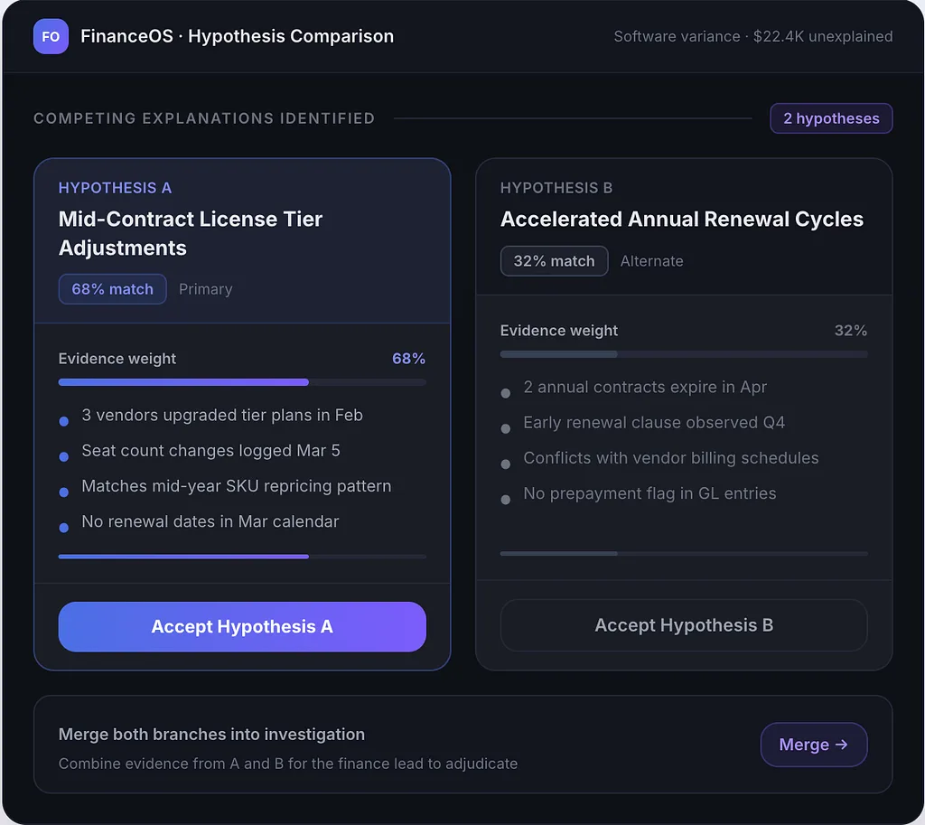
Split hypothesis comparison view. Hypothesis A (68% match): Mid-Contract License Tier Adjustments. Hypothesis B (32% match): Accelerated Annual Renewal Cycles. Each card shows evidence bullets, a confidence meter, and an accept button. A merge option lets the user combine both branches.
Graceful Fallbacks and the Failure Boundary
Every AI system will fail. It will encounter out-of-distribution inputs, corrupted data streams, conflicting intents, or unresolvable ambiguities.
The mark of an AI-native interface is how it behaves when things go wrong.
In bolted-on AI, failure is a dead end. The chatbot returns a generic message: “I’m sorry, I cannot process that request. Please try again.” The user is left stranded, with no clear path forward.
In an AI-native architecture, failure is designed as a smooth transition back to deterministic control. I call this the Failure Boundary.
When the system recognizes that its confidence has fallen below an acceptable threshold, it executes a graceful fallback:
- Acknowledge the specific gap: The system states exactly what it could not resolve (e.g., “Unable to reconcile vendor ID #8849 with active procurement contracts”).
- Preserve partial work: If the system successfully parsed 80% of the ledger but failed on the remaining 20%, it renders the valid portions and isolates the unparsed rows.
- Surface deterministic tools: The workspace automatically exposes manual filters, reconciliation tables, and raw search bars directly around the problematic data.
The user never hits a blank wall. The system does what it can, explains where it stalled, and hands control back to the operator with the right manual tools already open.
Designing the Partnership Between Intent and Execution
Across this series, I have tracked a fundamental progression in how software is conceived and built:
- In Part 1, I broke down why taping a chat sidebar onto an old layout fails to transform the workflow, and why true AI-native design requires reorganizing around user goals.
- In Part 2, I mapped the shift from navigation-first to intent-first software, collapsing the distance between what a user wants to achieve and where the work begins.
- In Part 3, I explored the mechanics of adaptive workspaces, examining how interfaces adjust their shape around real-time context without creating disorientation.
- Here in Part 4, I have addressed the central requirement for making those adaptive systems viable: designing for uncertainty and calibrating trust through legible, steerable interactions.
The ultimate goal of AI-native UX is not full automation, nor is it the elimination of human input. The real goal is a tight partnership between human intent and machine execution.
When software begins with intent, dynamically adapts to the task, surfaces its evidence with clarity, and yields control gracefully when uncertain, it stops feeling like a fragile tool. It becomes a reliable working environment where humans think faster, explore deeper, and make better decisions.
Building these interfaces is significantly harder than designing static screens. It requires product teams to think in dynamic states, probabilistic bounds, evidence paths, and ergonomic fallback systems.
That is the work ahead for designers, engineers, and product leaders.
Actionable Takeaway for Product Teams: Audit your AI interfaces for silent assumptions. Whenever your system generates a recommendation or reorganizes a workspace, ensure there are at least three visible anchors: a clear indication of confidence, an expandable trail of source evidence, and an immediate visual mechanism for the user to edit or reject the underlying premises.
The shift from navigation to intent, static views to adaptive canvases, and binary certainty to calibrated trust isn’t a cosmetic trend, it is the baseline for the next era of enterprise software.
Over to you:
In your current workflows, what is the harder hurdle: pulling users out of automation complacency, or overcoming skeptical avoidance? How are you visualizing confidence in your own interfaces? Let’s discuss below.