 Akhand Singh
Building Scalable UI Architectures · Part 4
Design Systems That Scale Inside Product Teams
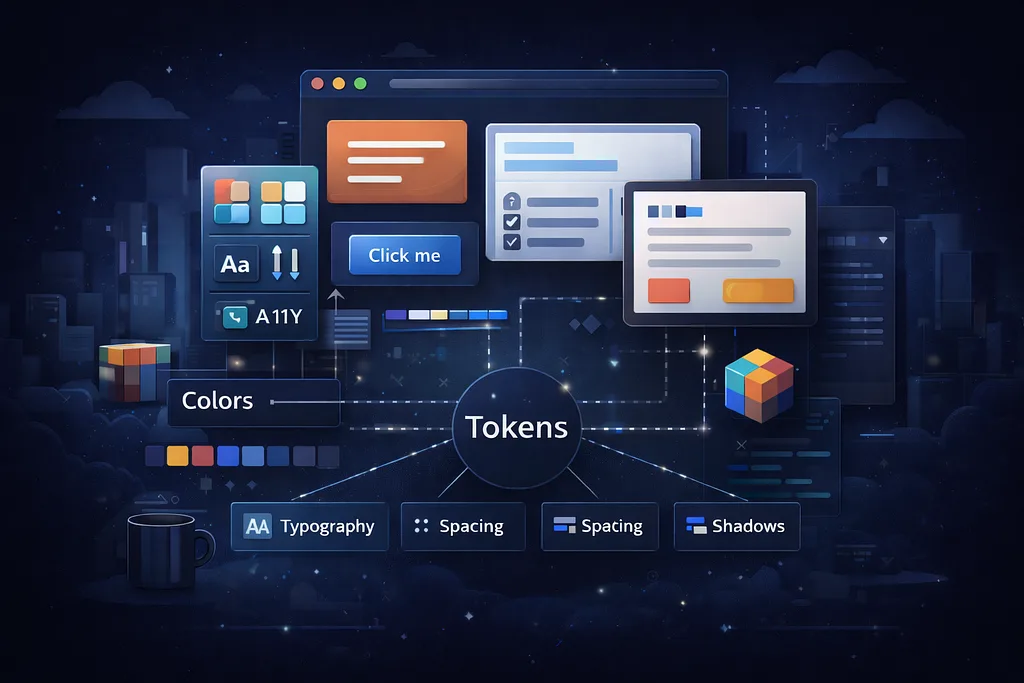
Design systems scale best when tokens, reusable primitives, and product boundaries work together as one architectural system
In Part 1, I introduced the layered frontend architecture that has helped me scale products across multiple startups. In Part 2, I showed how that architecture becomes more enforceable and maintainable inside a modular monorepo. In Part 3, I extended the same thinking to observability and user insights.
Now, I want to cover another layer that becomes critical as product teams grow: the design system.
A scalable frontend architecture is not only about where code lives. It is also about how teams create consistent experiences without slowing each other down. At some point, every growing product reaches the same challenge:
How do we maintain UI consistency, accessibility, and reuse across multiple features and teams without turning the shared layer into a bottleneck?
That is where a good design system earns its place.
Over time, I have learned that the strongest product teams do not treat the design system as a side project or a folder full of buttons. They treat it as a system of decisions: shared tokens, shared primitives, accessibility rules, composable APIs, and clear governance around what belongs in the shared layer versus what should stay local.
In this post, I’ll walk through how I think about design systems inside scalable product teams, how they connect to the SDK layer, and the practical rules that have helped keep shared UI clean and useful instead of bloated and fragile.
Revisiting the Architecture
In the earlier parts of this series, I described a layered structure that keeps responsibilities clean:
- SDK Layer: internal UI kit, presentational and reusable
- Domain Layer: feature-specific UI and behavior
- API/Logic Layer: typed data access, state handling, async interactions
That same structure still applies here. The design system does not replace the SDK layer. It strengthens it.
You can think of it like this:
packages/
  sdk/            → UI primitives and composable shared components
  styles/         → tokens, themes, global styles
  types/          → shared component types and contracts
  utils/          → UI-safe helpers
  api/            → typed data access
  hooks/          → reusable logic
  context/        → theme, auth, feature flags
  test/           → shared test helpers
apps/
  web-app/
    domain/
      map/
      onboarding/
      settings/
    routes/
  admin-panel/
    domain/
      users/
      reports/
The design system lives primarily across sdk/ and styles/, but its influence goes further. It shapes how components are named, how accessibility is built in, how theming works, and how teams decide whether a pattern should become shared.
That distinction matters a lot.
SDK vs Design System
One of the most common mistakes I see is treating the SDK and the design system as the same thing.
They are related, but they are not identical.
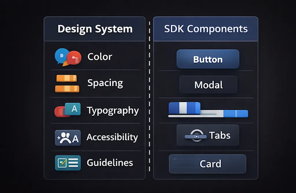
The design system is the shared language:
- Colors
- Spacing
- Typography
- Motion
- Elevation
- Interaction Patterns
- Accessibility Expectations
- Component Usage Guidelines
The SDK is the implementation layer:
- Button
- Input
- Modal
- Tabs
- Tag
- Tooltip
- Card
- Stack
- Grid
In other words, the design system defines the rules. The SDK expresses those rules in code.
That separation helps in two important ways.
First, it keeps the shared layer from becoming a random collection of product-specific components. Second, it gives teams a stable foundation they can compose in different ways across domains.
For example:
// packages/sdk/button/Button.tsx
export interface ButtonProps extends React.ButtonHTMLAttributes<HTMLButtonElement> {
  variant?: 'primary' | 'secondary' | 'ghost' | 'danger';
  size?: 'sm' | 'md' | 'lg';
  isLoading?: boolean;
  leadingIcon?: React.ReactNode;
}

export function Button({
  variant = 'primary',
  size = 'md',
  isLoading = false,
  leadingIcon,
  children,
  ...props
}: ButtonProps) {
  return (
    <button
      className={cx('my-button', `my-button--${variant}`, `my-button--${size}`)}
      disabled={isLoading || props.disabled}
      {...props}
    >
      {leadingIcon}
      <span>{children}</span>
    </button>
  );
}
This belongs in the SDK because it is presentational, composable, and broadly reusable.
Now compare that to something like this:
// apps/web-app/domain/onboarding/ConnectCloudButton.tsx
export function ConnectCloudButton() {
  const { connect, isLoading } = useCloudIntegration();
  const track = useTrackEvent();

  return (
    <Button
      variant="primary"
      isLoading={isLoading}
      onClick={() => {
        track('onboarding_connect_cloud_clicked');
        connect();
      }}
    >
      Connect Cloud Account
    </Button>
  );
}
This should stay in the domain layer.
It uses the SDK, but it is not part of the design system. It contains domain-specific behavior, analytics, and product meaning. If you move this into the shared layer, the SDK starts absorbing business logic, and the boundary becomes blurry very quickly.
That is usually the beginning of shared-layer bloat.
Design System vs SDK Components
Why Design Systems Become Necessary
In early-stage products, teams can move quickly by building most things locally. That speed is useful. In fact, it is often the right tradeoff.
But as the product grows, patterns start repeating:
- Multiple modals with slightly different close behavior
- Multiple tables with different empty states
- Five tag styles that all mean “warning”
- Inconsistent keyboard behavior across menus and dialogs
- Duplicated spacing and typography decisions
- Dark mode handled differently in different features
- Accessibility fixed one screen at a time instead of one component at a time
At that point, the issue is no longer just code duplication. It becomes a product consistency problem and an operational scale problem.
Without a design system, every team keeps solving the same UI problems over and over again. That slows delivery, increases drift, and makes the product feel fragmented even when the underlying architecture is technically sound.
A good design system reduces that cost by standardizing the decisions that should not be re-litigated every sprint.
Tokens First, Components Second
If I had to choose where a scalable design system really starts, I would not say components. I would say tokens.
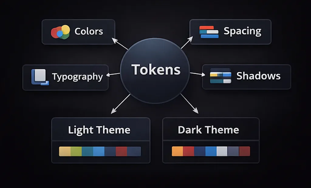
Tokens are what allow consistency to scale across components, screens, and themes. They give your UI a shared vocabulary that can evolve without forcing you to rewrite everything.
A simple token structure might look like this:
// packages/styles/tokens.ts
export const tokens = {
  color: {
    bg: {
      canvas: 'var(--color-bg-canvas)',
      surface: 'var(--color-bg-surface)',
      elevated: 'var(--color-bg-elevated)',
    },
    text: {
      primary: 'var(--color-text-primary)',
      secondary: 'var(--color-text-secondary)',
      muted: 'var(--color-text-muted)',
    },
    border: {
      subtle: 'var(--color-border-subtle)',
      strong: 'var(--color-border-strong)',
    },
    intent: {
      info: 'var(--color-intent-info)',
      success: 'var(--color-intent-success)',
      warning: 'var(--color-intent-warning)',
      danger: 'var(--color-intent-danger)',
    },
  },
  spacing: {
    xs: '4px',
    sm: '8px',
    md: '12px',
    lg: '16px',
    xl: '24px',
  },
  radius: {
    sm: '6px',
    md: '10px',
    lg: '14px',
  },
  shadow: {
    sm: 'var(--shadow-sm)',
    md: 'var(--shadow-md)',
  },
  typography: {
    bodySm: '400 13px/20px Inter, sans-serif',
    bodyMd: '400 14px/22px Inter, sans-serif',
    labelMd: '600 14px/20px Inter, sans-serif',
    titleSm: '600 16px/24px Inter, sans-serif',
  },
};
The important thing here is not just that tokens exist. It is that they are semantic.
- color.intent.warning scales better than hardcoding #f5a623.
- spacing.lg scales better than every component choosing between 14px, 15px, and 16px.
- text.secondary scales better than each feature inventing its own muted text color.
Semantic tokens also make theming much easier.
Tokens First, Components Second
Theming Without Chaos
Theming is one of those areas where teams often underestimate future needs. At first, it seems like a simple light versus dark mode toggle. Later, you realize you also need:
- Product branding flexibility
- Internal admin themes
- Enterprise customization
- Accessible contrast adjustments
- Stateful styling consistency across all components
That is why it helps to separate raw values from semantic meaning.
For example:
/* packages/styles/themes/light.css */
:root[data-theme='light'] {
  --color-bg-canvas: #ffffff;
  --color-bg-surface: #f8fafc;
  --color-bg-elevated: #ffffff;

  --color-text-primary: #0f172a;
  --color-text-secondary: #334155;
  --color-text-muted: #64748b;

  --color-border-subtle: #e2e8f0;
  --color-border-strong: #cbd5e1;

  --color-intent-info: #2563eb;
  --color-intent-success: #059669;
  --color-intent-warning: #d97706;
  --color-intent-danger: #dc2626;
}

/* packages/styles/themes/dark.css */
:root[data-theme='dark'] {
  --color-bg-canvas: #020617;
  --color-bg-surface: #0f172a;
  --color-bg-elevated: #111827;

  --color-text-primary: #f8fafc;
  --color-text-secondary: #cbd5e1;
  --color-text-muted: #94a3b8;

  --color-border-subtle: #1e293b;
  --color-border-strong: #334155;

  --color-intent-info: #60a5fa;
  --color-intent-success: #34d399;
  --color-intent-warning: #fbbf24;
  --color-intent-danger: #f87171;
}
With this model, components do not care whether the app is in light or dark mode. They only consume semantic tokens. That keeps the component API stable and the theme layer flexible.
The same approach also makes future rebranding or product line variation much easier.
Accessibility Should Shape the API
A mature design system is not just visually consistent. It is accessible by default.
This is one of the biggest advantages of investing in the shared layer. If accessibility is baked into shared primitives, every feature gets the benefit automatically.
For example, your modal primitive should already handle:
- Focus trapping
- Escape key behavior
- Aria roles
- Accessible labelling
- Keyboard navigation
- Scroll locking
- Restore focus on close
That way, product teams are not rebuilding modal behavior from scratch every time.
A simplified example:
// packages/sdk/modal/Modal.tsx
interface ModalProps {
  title: string;
  description?: string;
  open: boolean;
  onClose: () => void;
  children: React.ReactNode;
}

export function Modal({ title, description, open, onClose, children }: ModalProps) {
  if (!open) return null;

  return (
    <div role="presentation" className="my-modal-backdrop" onClick={onClose}>
      <div
        role="dialog"
        aria-modal="true"
        aria-labelledby="modal-title"
        aria-describedby={description ? 'modal-description' : undefined}
        className="my-modal"
        onClick={(e) => e.stopPropagation()}
      >
        <header>
          <h2 id="modal-title">{title}</h2>
          {description ? <p id="modal-description">{description}</p> : null}
        </header>
        <div>{children}</div>
      </div>
    </div>
  );
}
In a real implementation, you would likely rely on well-tested primitives or libraries for the full accessibility behavior. But the key principle remains the same: accessibility belongs in the component contract, not in a cleanup pass later.
I have found that this improves more than inclusion. It also improves component quality. APIs become clearer. Behavior becomes more predictable. Edge cases are handled once instead of repeatedly.
In practice, accessibility is one of the best forcing functions for better shared component design.
Keeping Presentational Components Clean
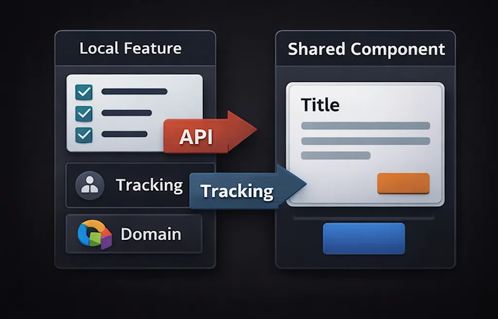
This has been one of the strongest recurring rules throughout my architecture work: shared UI should remain presentational.
The moment your SDK starts depending on domain assumptions, feature flags, route awareness, analytics events, or backend response shapes, it stops being a reliable foundation.
A clean shared component should answer a UI question, not a product question.
✅ Good shared component:
// packages/sdk/empty-state/EmptyState.tsx
interface EmptyStateProps {
  title: string;
  description?: string;
  illustration?: React.ReactNode;
  action?: React.ReactNode;
}

export function EmptyState({ title, description, illustration, action }: EmptyStateProps) {
  return (
    <div className="my-empty-state">
      {illustration}
      <h3>{title}</h3>
      {description ? <p>{description}</p> : null}
      {action}
    </div>
  );
}
✅ Good domain composition:
// apps/web-app/domain/alerts/NoAlertsState.tsx
export function NoAlertsState() {
  return (
    <EmptyState
      title="No active alerts"
      description="Everything looks stable right now. When new alerts appear, they’ll show up here."
      action={<Button variant="secondary">View alert history</Button>}
    />
  );
}
❌ Problematic shared component:
// packages/sdk/alerts/AlertEmptyState.tsx
export function AlertEmptyState() {
  const alerts = useAlerts();
  const navigate = useNavigate();
  const track = useTrackEvent();

  // domain logic, app navigation, analytics inside sdk
}
That last version might feel convenient in the moment, but it is the sort of convenience that becomes expensive later. Shared layers should not depend on specific product workflows.
A useful test is this:
- If I moved this component into another product tomorrow, would its API still make sense?
If the answer is no, it probably belongs in the domain layer.
Keeping Presentational Components Clean
When to Extract a Pattern
This is where design systems usually succeed or fail.
Some teams extract too early and end up with generic components nobody likes using. Other teams extract too late and accumulate duplication everywhere.
The right question is not “Can this be shared?”
The better question is “Has this pattern become stable enough and common enough to deserve standardization?”
Here are the signals I usually look for.
Extract into the shared layer when:
- The pattern appears in multiple domains or apps
- The interaction model is stable
- The API can stay relatively simple
- Accessibility and consistency matter across all instances
- Standardization will reduce repeated decisions
For example:
- Buttons
- Form fields
- Layout primitives
- Dialogs
- Menus
- Tabs
- Badges/Tags
- Tables or Table primitives
- Empty states
- Skeleton loaders
- Toasts
- Tooltips
Keep local when:
- The pattern is specific to one workflow
- Requirements are changing rapidly
- The abstraction introduces awkward props
- Naming becomes vague or overly generic
- The component only looks reusable because two screens happen to resemble each other today
For example, a highly specific onboarding stepper with domain-specific progress logic may look like a shared pattern at first. But if it carries product terminology, conditional branching, analytics, and route coupling, it likely belongs in the domain layer for now.
A practical example:
// good candidate for sdk
<Tabs items={items} selectedKey={selectedKey} onSelectionChange={setSelectedKey} />

// probably domain-specific
<AlertInvestigationTabs
  alertId={alertId}
  impactCount={impactCount}
  onOpen={...}
/>
- The first solves a general UI problem.
- The second solves a product workflow problem.
Not every repeated thing deserves promotion into the design system.
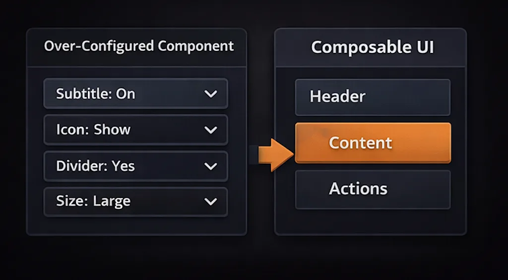
Composition Beats Over-Configuration
Another lesson I trust more every year: shared components scale better through composition than through endless prop growth.
It is very tempting to keep adding props to a shared component:
- showIcon
- showSubtitle
- showMetadata
- alignActions
- compact
- dense
- withDivider
- emphasized
- collapsible
Eventually, the component becomes hard to understand and harder to maintain.
A better pattern is to create smaller primitives that compose well.
For example:
<Card>
  <CardHeader
    title="Deployment History"
    subtitle="Recent service releases and rollout state"
    action={<Button variant="ghost">View all</Button>}
  />
  <CardBody>
    <DeploymentTable />
  </CardBody>
</Card>
This usually scales better than one giant DashboardCard with twenty specialized props.
Composition keeps the shared layer flexible without making it domain-aware.
Composition Beats Over-Configuration
Governance Without Bureaucracy
A design system does need governance. But good governance should improve velocity, not suffocate it.
The goal is not to create a committee for every button change. The goal is to keep the shared layer healthy.
A lightweight governance model can work really well:
1. Clear ownership
Some team or set of engineers/designers should own the shared layer. That does not mean they are the only contributors. It means they are responsible for quality, direction, and consistency.
2. Contribution guidelines
If a product team wants to add or modify a shared component, there should be a clear path:
- What problem it solves
- Why it belongs in shared
- Expected API
- Accessibility considerations
- Visual examples
- Migration implications
3. Story-driven documentation
Every shared component should have examples of:
- Default usage
- Variants
- Edge cases
- Loading or disabled states
- Accessibility behavior where relevant
This helps both onboarding and regression prevention.
4. Deprecation discipline
A system becomes harder to use when old and new patterns coexist forever. If you introduce a better primitive, create a path to migrate the old one.
5. Review shared APIs carefully
A small decision in the SDK can affect dozens of screens. That is why I tend to review naming, prop shape, and composition patterns more carefully in the shared layer than in local feature code.
Good governance is really about protecting leverage.
Testing the Design System
The shared layer deserves stronger testing than feature code in some areas, because breakage there multiplies across the app.
A practical testing stack usually includes:
- Unit tests for behavior and edge cases
- Accessibility checks where possible
- Visual stories for variants and states
- Interaction tests for components like Dropdowns, Dialogs, Tabs, and Tooltips
For example:
// packages/sdk/button/Button.test.tsx
import { render, screen } from '@testing-library/react';
import userEvent from '@testing-library/user-event';
import { Button } from './Button';

test('calls onClick when pressed', async () => {
  const user = userEvent.setup();
  const onClick = vi.fn();

  render(<Button onClick={onClick}>Save</Button>);
  await user.click(screen.getByRole('button', { name: 'Save' }));

  expect(onClick).toHaveBeenCalledTimes(1);
});

test('is disabled while loading', () => {
  render(<Button isLoading>Save</Button>);
  expect(screen.getByRole('button', { name: 'Save' })).toBeDisabled();
});
And visually, a story file helps keep the design system legible:
// packages/sdk/button/Button.stories.tsx
export const Variants = () => (
  <Stack gap="md">
    <Button variant="primary">Primary</Button>
    <Button variant="secondary">Secondary</Button>
    <Button variant="ghost">Ghost</Button>
    <Button variant="danger">Danger</Button>
  </Stack>
);
That documentation becomes even more valuable as more teams consume the SDK.
A mature design system also needs an operational home. For many teams, that ends up being Storybook. Used well, it is not just a showcase of buttons and inputs. It becomes the place where shared UI is documented, reviewed, and increasingly tested before it lands in product workflows.
Storybook 10 continues that direction with stronger testing workflows around stories, including Vitest-based component testing, interaction testing, visual testing integrations, and its broader addon ecosystem.
I would still keep this as a support layer rather than the center of the system, but it is a very practical way to make design-system quality visible and repeatable as teams grow. One caution, especially around Storybook 10 upgrades, is that it is now ESM-only and addon compatibility can require extra attention during migration.
Example: Designing a Scalable Tag System
A good example of where design systems either help or hurt is tags and badges.
Teams often use them everywhere:
- status
- severity
- environment
- ownership
- category
- health state
Without shared rules, tags quickly become inconsistent and overloaded.
A better approach is to keep the primitive simple and map domain meaning in the product layer.
Shared primitive:
// packages/sdk/tag/Tag.tsx
interface TagProps {
  children: React.ReactNode;
  tone?: 'neutral' | 'info' | 'success' | 'warning' | 'danger';
  variant?: 'soft' | 'solid' | 'outline';
  icon?: React.ReactNode;
}

export function Tag({
  children,
  tone = 'neutral',
  variant = 'soft',
  icon,
}: TagProps) {
  return (
    <span className={cx('my-tag', `my-tag--${tone}`, `my-tag--${variant}`)}>
      {icon}
      {children}
    </span>
  );
}
Domain mapping:
// apps/web-app/domain/alerts/AlertSeverityTag.tsx
export function AlertSeverityTag({ severity }: { severity: 'critical' | 'warning' | 'info' }) {
  const tone = {
    critical: 'danger',
    warning: 'warning',
    info: 'info',
  }[severity];

  return <Tag tone={tone}>{severity}</Tag>;
}
This gives you consistency in spacing, typography, states, and theming while allowing the product to control meaning.
That is usually the sweet spot.
Principles I’ve Come to Rely On
Across products and teams, a few design system principles have consistently held up for me:
- Start with tokens, not just components
- Keep shared components presentational
- Prefer composition over highly configurable mega-components
- Accessibility should shape APIs early
- Shared layers should solve UI problems, not domain workflows
- Extract patterns only after they prove stable and reusable
- Use semantic tokens so theming can evolve safely
- Document examples, not just props
- Governance should guide quality, not block teams
- A smaller, cleaner design system is usually more scalable than a larger, noisier one
Final Thoughts
A design system is not valuable because it centralizes components. It is valuable because it centralizes decisions that should be consistent across the product.
When done well, it gives product teams speed without sacrificing quality. It keeps shared UI predictable, accessible, and easier to evolve. It reduces repeated work, lowers visual drift, and makes the frontend architecture more resilient as the team grows.
Just as importantly, it helps preserve the boundary that matters so much in scalable frontend systems: the shared layer provides composable UI primitives, while the domain layer owns product meaning and behavior.
That separation is what keeps the system healthy.
You do not need to build a massive design system on day one. In fact, you probably should not. But once your team starts repeating the same patterns, solving the same accessibility problems, and debating the same interaction details over and over, it is time to invest.
The goal is not to create more shared components.
The goal is to create better boundaries, better defaults, and better ways for teams to build consistently together.